Add Borders to Flickr Images
Flickr's recent move from beta to gamma introduced a slew of changes to the look and feel of the site. Most of the changes seemed to be centered around navigation, and finding ways to give quick access to all of Flickr's features. All well and good.
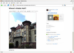
However, there was one fundamental design change in the upgrade that affects every image you view on Flickr—they removed photo borders. Flickr used to display a 1-pixel wide gray border around every photo, both on photo detail pages, and on photostream pages. This border was important because it separated the photograph from the background. The effect is subtle most of the time, but has a big impact with certain photos. Here's an example:

This photo of mine on Flickr has white at the edges, and without the border the photo bleeds into the background. Obviously you can imagine where the photo ends and page begins by drawing a mental line from the colored parts of the photo through the white parts of the photo. But the gray border used to do that work for you, and in the process made the site feel more solid.
Luckily, because I use Firefox, I can change the look of Flickr with a few lines of CSS. I put the gray border back on both image detail pages and photostream pages, and I'm already more productive thanks to eliminating the mental strain of imagining borders around photos. If you'd like to give your brain a little less work while browsing Flickr, here's how it's done:

I think light gray (#999) is the best color for the border, but you can make it lighter or darker by adjusting the value lighter (#ccc) or darker (#666). You might also experiment with padding and background colors if you want to mimic the white/gray borders I often use for photos here.
If you're not already obsessing over details like this, try tuning in to photo borders at other sites and in photo applications. Of course you're not supposed to notice the border (or lack thereof). But like any physical frame, pixel borders can enhance or detract from your photographs.
Update: After living with this for a day or two, I decided to go with a lighter gray border, #ccc. Just change #999 to #ccc in the CSS above if you'd like to do the same.
However, there was one fundamental design change in the upgrade that affects every image you view on Flickr—they removed photo borders. Flickr used to display a 1-pixel wide gray border around every photo, both on photo detail pages, and on photostream pages. This border was important because it separated the photograph from the background. The effect is subtle most of the time, but has a big impact with certain photos. Here's an example:

This photo of mine on Flickr has white at the edges, and without the border the photo bleeds into the background. Obviously you can imagine where the photo ends and page begins by drawing a mental line from the colored parts of the photo through the white parts of the photo. But the gray border used to do that work for you, and in the process made the site feel more solid.
Luckily, because I use Firefox, I can change the look of Flickr with a few lines of CSS. I put the gray border back on both image detail pages and photostream pages, and I'm already more productive thanks to eliminating the mental strain of imagining borders around photos. If you'd like to give your brain a little less work while browsing Flickr, here's how it's done:
- Locate your Firefox profile folder.
- Open the chrome folder and open the file userContent.css in a text editor like Notepad. (You might have to create the file if it doesn't exist yet.)
- Add the following bit of CSS to the file:
@-moz-document domain(flickr.com) { .reflect { border:solid #999 1px !important; } .Photo img { border:solid #999 1px !important; } } - Save userContent.css and restart Firefox.

I think light gray (#999) is the best color for the border, but you can make it lighter or darker by adjusting the value lighter (#ccc) or darker (#666). You might also experiment with padding and background colors if you want to mimic the white/gray borders I often use for photos here.
If you're not already obsessing over details like this, try tuning in to photo borders at other sites and in photo applications. Of course you're not supposed to notice the border (or lack thereof). But like any physical frame, pixel borders can enhance or detract from your photographs.
Update: After living with this for a day or two, I decided to go with a lighter gray border, #ccc. Just change #999 to #ccc in the CSS above if you'd like to do the same.