One day, I saw what felt like Gorton on a ferry traversing the waters Bay Area. A few weeks later, I spotted it on a sign in a national park. Then on an intercom. On a street lighting access cover. In an elevator. At my dentist’s office. In an alley.
Beautiful story of discovering some surprisingly ubiquitous typography that tells us about past production methods.
This is a free typeface for developers that looks niiiiice. Consolas is my preferred font for programming but I will give JetBrains Mono a try. Similarly, I'm enjoying the Dracula color theme in console windows and VSCode. It's similar to my usual preferred theme Solarized (dark), but sometimes you just have to throw caution to the wind and try a new font and color theme, you know?
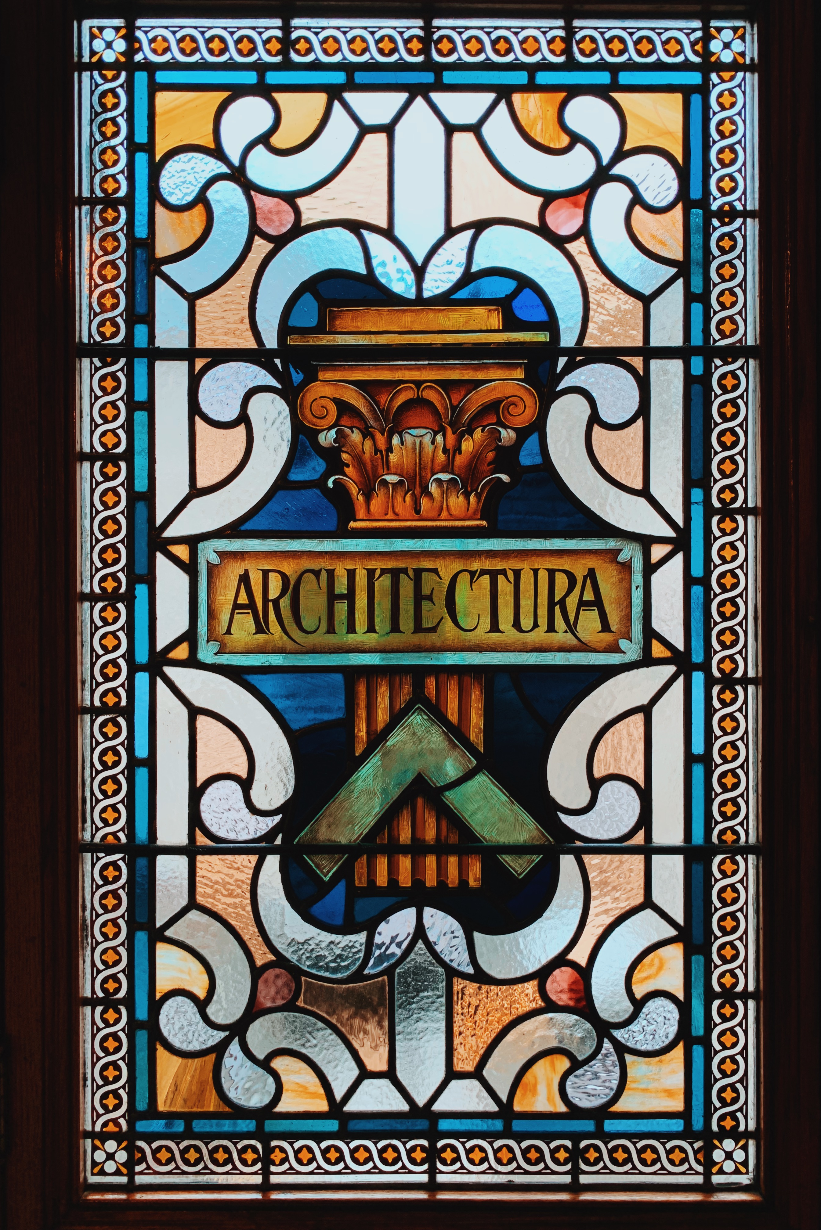
I love the Paris summer olympics logo and type design. I’m a pushover for deco inspired type. Even though I know it’s the Mini Cooper move of forming fonts it always strikes me as hopeful future. And compared with some of the goofy Olympic logos of the past, this one is playful and clever.
This is a fun font based on physical router templates that the national forest service uses to carve wooden signs. The great discussion at MetaFilter has some more context and also pointed to the similarly inspired Routed Gothic.
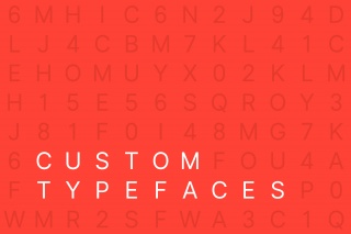
This post by Arun Venkatesan discusses why companies are designing custom—though very similar—typefaces. It's also a quick history of digital typography. [via Tecznts]